Ext 4 Overview Guide
Ext 4 is a revolutionary step forward in web app development. Almost every major component within the framework has been improved, in many cases drastically so. There are also many components and subsystems that are brand new since Ext 3. This guide will provide an introduction to all major changes between Ext 3 and 4.
If you find any issues in this document or would like to provide feedback, please visit the Ext 3 to 4 Migration thread in the Sencha forums.
General
These changes apply across both Ext Core and Ext JS.
Ext 3 Compatibility
Ext 4 is by far the most comprehensive update to Ext JS that we've ever produced, and many changes were required that are not compatible with Ext 3. However, we've gone to great lengths to provide as much backwards-compatibility as possible.
JS Compatibility Layer
This is an optional JavaScript file that can be referenced after Ext 4 is loaded that will provide the aliases and overrides necessary to make the vast majority of Ext 3 code run correctly under Ext 4 as-is.
NOTE: At the moment this compatibility layer is not yet available, but it will be prior to the final 4.0 release.
Sandbox Mode
Ext 4 has introduced changes that now make it possible to completely sandbox previous versions of the framework alongside Ext 4 within the same page. On the JavaScript side, this is possible with the removal of all prototypal enhancements to core JavaScript objects in Ext 4. Now you can simply alias the global Ext object to a different name and be completely isolated from previous Ext versions.
On the markup/CSS side of things, Ext 4 now uses CSS generated from templates using Compass & SASS, so it is trivial to customize the prefix of all CSS rules defined by the framework. Combined with the new Ext.baseCSSPrefix property, it is now extremely easy to isolate markup generated from multiple versions of Ext on a single page.
Package & Namespace Updates
All classes and packages have been restructured according to a strict naming convention. This makes classes more consistent and easier to find. For example, in Ext 3 classes like Button, CycleButton and SplitButton are simply grouped under /widgets (along with many other classes). The classes are also defined directly on the global Ext object.
In Ext 4, every class has been consistently placed into packages and namespaces based on related functionality. This is not entirely new, but was never consistently enforced in Ext 3. Back to the Button example above, in Ext 4 these classes are now:
- Grouped into a single src/button/ package at the file level
- Grouped into a new Ext.button namespace in code
- Renamed based on the new namspaces (e.g., Ext.SplitButton → Ext.button.Split)
All classes that were reorganized are still available via the new alternateClassName property, so Ext 3 classnames will still work under Ext 4 if necessary (e.g. alternateClassName: 'Ext.SplitButton'). Going forward with Ext 4 development it's recommended that you migrate to the new conventions in your own code.
Ext Core
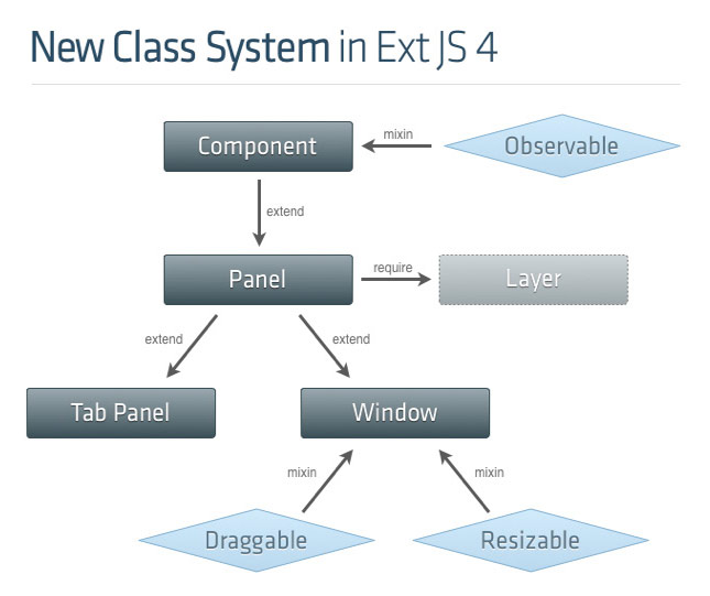
New Class System
Resources
Ext of course is already built on a powerful prototype-based class system, which approximates a traditional OO-based class system. In Ext 4 we've taken our class system to a new level of flexibility with the addition of many key features, and best of all the changes are 100% backwards-compatible with the Ext 3 class system. The main new features are:
- Ext.define to create class definitions within the new system
- Automatic dependency management and dynamic class loading
- Mixins
- Statics
- New config option for Automatic setter / getter generation
Class Definition
You can still use the tried and true new ClassName() syntax in Ext 4, but the preferred syntax going forward is to use the new Ext.define function to define new classes. By defining classes explicitly within the Ext class system all of the additional class features in the following sections become enabled. The new keyword will still work, but without those benefits.
An additional benefit of using Ext.define is that it will automatically detect and create new namespaces as needed, without the need for explicitly defining the namespaces separately from declaring the classes that use them.
Here's a simple example of the old and new syntax for how you would define a custom class that extends an existing Ext component:
// Ext 3:
Ext.ns('MyApp'); // required in Ext 3
MyApp.CustomerPanel = Ext.extend(Ext.Panel, {
    // etc.
});

// Ext 4
Ext.define('MyApp.CustomerPanel', {
    extend: 'Ext.panel.Panel',
    // etc.
});
Class Loading
Ext 4 now includes a robust dynamic class loading system that also provides integrated dependency management. Again, this is an optional feature, but provides a couple of key benefits:
- Dynamic loading: Classes can be loaded dynamically and asynchronously at runtime simply based on the dependency tree that Ext manages internally. This means that you can stop managing brittle blocks of manual include tags in HTML pages and simply let the class loader figure out what your page needs to run. This is mostly useful in the development environment when dependency flexibility is more important than page load speed.
- Dynamic build generation: For production, it's usually preferable still to compile down to a single (or few) build files. Since Ext now understands the entire dependency graph at runtime, it can easily output that graph as needed (for example, in the form of a custom build configuration). And even more importantly, this capability is not restricted to the Ext namespace. You can include any number of custom classes and namespaces in addition to Ext and as long as everything is defined using the class system Ext will be able to figure out how they all relate. In the very near future, any Ext developer will have one-click custom build capability that automatically manages the entire Ext + custom application class graph, even as it changes from one minute to the next, and only builds exactly what's actually needed by the app.
This dynamic loading is enabled simply by using Ext.define and by defining the dependencies in code using two new class properties:
- requires: The class dependencies required for a class to work. These are guaranteed to be loaded prior to the current class being instantiated.
- uses: Optional class dependencies that are used by, but not required by, a class. These can be loaded asynchronously and do not have to be available for the class to be instantiated.
Mixins
This is a new approach to plugging custom functionality into existing classes. The new mixins config, included during instantiation of a class, allows you to "mix in" new capabilities to the class prototype. This is similar to the existing Ext.override function, although it does not replace existing methods like override does, it simply augments the prototype with whatever is new. Example syntax:
Ext.define('Sample.Musician', {
    extend: 'Sample.Person',

    mixins: {
        guitar: 'Sample.ability.CanPlayGuitar',
        compose: 'Sample.ability.CanComposeSongs',
        sing: 'Sample.ability.CanSing'
    }
});
Statics
Any class can now define static methods simply by defining them in its statics class property.
Config
In Ext we currently use the term config to mean any properties on a class prototype that, by convention, make up its configurable API and can be set by calling code. While this is still true in Ext 4, there is also a new optional config that's actually called config. When configuration properties are added to the config property, it will automatically generate a getter, setter, reset and apply (template method for custom setter logic) methods matching that property. For example, given this code:
Ext.define('MyClass', {
    config: {
        title: 'Default Title'
    }
});
...the following methods will get generated automatically behind the scenes:
title: 'Default Title',

getTitle: function() {
    return this.title;
},

resetTitle: function() {
    this.setTitle('Default Title');
},

setTitle: function(newTitle) {
   this.title = this.applyTitle(newTitle) || newTitle;
},

applyTitle: function(newTitle) {
    // custom code here
    // e.g. Ext.get('titleEl').update(newTitle);
}
Env Namespace
Provides access to comprehensive information about the host browser and operating system, as well as a complete list of modern browser feature detection.
Ext.env.Browser
This class provides all of the browser metadata (name, engine, version, isStrict, etc.) that used to exist directly on the global Ext object.
Ext.env.FeatureDetector
This is a brand new class whose functionality did not exist in Ext 3. It provides properties detailing the feature capabilities of the running host environment, primarily to detect the availability of modern HTML5 and CSS3 features, as well as mobile features, including:
- CSS transforms / animations / transitions
- SVG / VML
- Touch availability / Orientation
- Geolocation
- SqlDatabase
- Websockets
- History
- Audio
- Video
Ext.env.OS
Identifies the current host operating system, and includes a more comprehensive list than Ext 3 did (adding various mobile OS'es).
Lang Package
Much of the functionality within this new package existed under Ext 3, but as modifications to core JavaScript object prototypes. While this was convenient, it made it very challenging for Ext to coexist with other frameworks that modified the same objects. It also meant that Ext was directly exposed to any changes that might occur in the ECMAscript specification going forward. To remedy these problems we've completely removed all core JavaScript object modifications and placed them all into appropriately namespaced static classes under the Ext object.
All of the Prototype enhancements to the following objects have been moved accordingly (note that there is not actually a lang namespace — it's just the package that holds these new files in the source tree):
- Array → Ext.Array
- Date → Ext.Date
- Function → Ext.Function
- Number → Ext.Number
- Object → Ext.Object
- String → Ext.String
Note that these will all be aliased back to the core object prototypes in the compatibility file, but in order to fully move to Ext 4 and remove the extra compatibility layer the usage of any of the Ext 3 versions of these functions will ultimately have to be updated to the new namespaced versions.
Ext.Function
There are a few noteworthy changes to how the base Function prototype methods have been implemented in Ext 4. Most importantly, the Function.createDelegate and Function.createCallback methods are now named Ext.Function.bind and Ext.Function.pass respectively. Likewise, Function.defer is now available as Ext.Function.defer. Because these three functions are so commonly used, they are also aliased directly onto the Ext object as Ext.bind, Ext.pass and Ext.defer.
The other Function methods like createSequence and createInterceptor have also been moved to Ext.Function, and there are also a few new useful additions like createBuffered and createThrottled.
Here are some examples of how the invocation syntax has changed:
// Ext 3:
myFunction.createDelegate(this, [arg1, arg2]);
myFunction.defer(1000, this);

// Ext 4:
Ext.bind(myFunction, this, [arg1, arg2];
Ext.defer(myFunction, 1000, this);
Ext JS
General
Adapters
In previous versions of Ext through version 3 we supported the use of third-party base libraries via adapters. As of Ext 4 this support has been discontinued. Moving forward, Ext Core will be the required foundation for all Ext JS applications. Of course third party libraries may still be optionally used in addition to Ext Core (and in fact this will even work better now that JavaScript object modifications have been removed from Ext), but they will no longer be supported as base library dependencies for Ext.
ARIA
Ext 4 features a new level of accessibility with full ARIA support baked right into every component in the framework. Ext.Component now has a config property called ariaRole which defaults to "presentation" (meaning the role is simply visual and provides no user interaction functionality) but can be easily overridden as needed. For example, Ext.button.Button overrides the default with ariaRole:'button'. This renders the standard role HTML attribute into the wrapping markup tag and tells screen readers that the contained markup (no matter how complex) functionally represents an action button. This is hugely important for accessibility and is now implemented throughout Ext.
Another important ARIA hint that is built into Ext.Component is automatic adding/removing of the standard aria-disabled HTML attribute to signify the enabled state of functional UI elements to screen readers.
Data
The data package has seen a significant upgrade since 3.x. Data is one of the many packages that Ext 4 now shares with Sencha Touch, and there is already a huge amount of information about it available today. Here are a few of the articles that give some background on the new capabilities — we strongly suggest reading at least the first one before diving into code:
Resources
Overview
Most of the changes in the data package are non-breaking when including the Ext 3 compatibility file. The biggest updates have come to Store, Proxy and Model, which is the new name for Record:
- Store no longer cares about the format of the data (e.g. no need for JsonStore, XmlStore and other store subclasses). It now delegates all of its loading and saving to the attached Proxy, which now receives the Reader and Writer instances. Store can also perform multi sorting, filtering and grouping dynamically on the client side, and can synchronize itself with your server
- Proxy can now be attached to either a Store or directly to a Model, which makes it easy to manipulate data without a Store. Proxies can be configured with Readers and Writers which decode and encode communications with your server.
- Model is a much more capable version of Record, adding support for associations, validations and much more.
Ext JS 4 also features the brand new LocalStorageProxy which seamlessly persists your Model data into HTML5 localStorage.
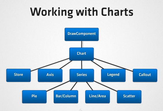
Draw
This package is entirely new and has no Ext 3 analog. This is an entire library that provides custom drawing capabilities by abstracting the standard SVG and VML engines, choosing the best one available at runtime based on the current browser. This package provides the foundation for the new charting package in Ext 4, but can also easily be used for any type of custom drawing and graphics needs. Here are the major features:
- HTML5 standards based
- Rendering of primitive shapes, text, images, gradients
- Library classes for manipulating color, matrix transformations, etc.
- Ext.draw.DrawComponent
- Extends Ext.Component
- Engine preference via feature detection
- Customizable engine preference order
- Layout participation
- Built-in sprite management via Ext.draw.Sprite
- Abstracted drawing elements
- Normalizes differences between engine API syntax
- Attributes
- Event support (extends Observable)
- Transforms (Rotate, Translate, Scale)
- Animation supported through Ext.fx
- SpriteComposites
Charting & Visualization
Charting in Ext 4 is a huge step forward from Ext 3, which did support charting, but only Flash-based. In Ext 4 we've completely removed Flash from the picture, yet retained complete best-of-breed browser support (all the way back to IE6) using Canvas, SVG and VML. The charting engine automatically selects the best engine for the current platform at runtime, and everything is rendered uniformly and with the best possible performance across all supported browsers. More importantly, all charting functions share a single uniform API, regardless of the underlying charting engine in use.
Fx
In Ext 3, the Fx class mainly provided a set of useful Element effects (slide, highlight, fade, etc.). In Ext 4 this basic functionality has been retained, but there is an entire Fx package that goes far beyond simple element effects.
There's now an underlying Animator class that coordinates multiple animations concurrently running on the page.
Components may now be animated in size and position via new Fx "target" classes (Ext.fx.target.*), which opens up many new possibilities for creating dynamic UI's.
Layout
ComponentLayout
Complex components use the new ComponentLayout (as opposed to ContainerLayout, the new name for the traditional Container-based layouts carried over from Ext 3) to perform sizing of internal elements in response to resize calls. An example of this is the FieldLayout which manages the size and position of both an associated label and input element within the containing Field Component.
FormLayout
As of Ext 4, FormLayout is no longer available. See Layout in the Form section later in this document for details.
BorderLayout
Border layout in Ext 4 is fully backwards-compatible to Ext 3.
Panel Headers now may be orientated vertically, so east and west regions are replaced on collapse by a vertical header (a full-fledged Ext.panel.Header instance, unlike the simple Element in Ext 3) containing the title rotated by 90 degrees (courtesy of Ext 4's new Draw package). The placeholder Header is accessible using the layout's new getPlaceholder method. The placeholder Component is not rendered until the Panel is first collapsed. All the methods of the Ext.panel.Header class are available on it. As a Container subclass, it also inherits all the methods of Container.
Another small difference is that the cmargins config is no longer supported. The placeholder Header now has the same margins that the expanded Panel did. This makes it easier to create layouts which look good in both collapsed and expanded states by default.
Internally, the BorderLayout class now uses nested HBox and VBox layouts to create the bordered arrangement, making the layout much more flexible and customizable than it has ever been.
Component
Any Component subclass may now be configured as floatable using the floating:true config to specify that it floats above the document flow. Floating components may be configured as draggable and/or resizable using the standard configs. They may also be added as child items to any container, in which case they will not participate in the container's layout, but will float above it.
All floating Components now have their z-index managed by a ZIndexManager. This is the successor to the Ext 3 WindowGroup class. By default, floating components (such as Windows) which are rendered into the document body by having their show method called are managed by the singleton Ext.WindowManager. All floating components therefore have a toFront and toBack method which invokes the ZIndexManager.
Floating components which are added to a specific Container acquire a ZIndexManager reference at render time. They search for an ancestor Container from which to request z-index management. Usually, this will be provided by the singleton Ext.WindowManager, but if the floating component is the descendant of a floating Container such as a Window, that Window will create its own ZIndexManager instance, and all floating Components within will be managed relative to the Window's z-index.
This is a huge improvement over previous versions of Ext, in which complex arrangements of floated containers could quickly lead to z-index conflicts among different components. Now, for example, the dropdowns of combo boxes that are contained in a window will always be correctly managed above that window.
Form
Layout
In Ext 3 the FormPanel used the FormLayout class for positioning field labels, input boxes, error indicators, etc. In Ext 4 FormLayout has been removed entirely, in favor of using standard layouts for overall arrangement and the new FieldLayout (one of the new ComponentLayout classes) for the field labels etc. This makes it now possible to use any kind of standard layouts within any form, making the creation of custom form layouts exceedingly simple compared to Ext 3.
The default container layout for FormPanel is now anchor, although any standard layout may now be used within forms.
FieldContainer
Ext4 also introduces a new class for managing form layouts: Ext.form.FieldContainer. This is a standard Ext.Container which has been enhanced to allow addition of a label and/or an error message, using all the same configurations regarding label and error placement that are supported by Ext.form.Labelable. The container's children will be confined to the same space as the field input would occupy in a real Field. This makes it easy to add any group of arbitrary components to a form and have them line up exactly with the form's fields.
Field as Mixin
One longstanding difficulty with Ext has been adding non-Field components into a form with field-like capabilities like layout, validation, value management, etc. The only way to easily inherit field behavior in Ext 3 was to subclass Ext.form.Field directly, but in reality many components must subclass something outside of the Field class hiearchy. Since Ext (and JavaScript) has no support for true multiple inheritance, the result is normally copying most if Field's code directly into the custom class, which is non-optimal to say the least.
Now that Ext 4 supports mixins as part of its updated class system, this is no longer an issue. Field can now be used as a mixin to any other component, making it simple to provide full Field API support to almost anything. And of course you can easily override methods as needed if the default Field behavior needs to be customized (it is common to override getValue and setValue for example).
Validation
A common desire when building forms is to give the user feedback on the validity of fields as immediately as possible, as the user is entering data. While this could be done in Ext 3, it was clumsy and required using the monitorValid option on FormPanel which was non-optimal for performance because it invoked full-form validation several times per second.
In Ext 4 we have reworked form validation to make immediate feedback more elegant and performant. This is enabled mainly by implementing a new event flow:
- Input fields now listen to a set of modern browser events that allow us to detect changes immediately as the user makes them via any possible method, including typing, cutting/pasting, and dragging text into the field. We handle these events and roll them up together, firing the field's changeevent when a change in its value is observed (discussed further below).
- Each field validates itself when its value changes. When its validity changes from valid to invalid or vice-versa, it fires a new validitychange event.
- When any of the validitychange events fired by the fields causes the overall validity of the enclosing form to change, the BasicForm fires a validitychange event of its own.
This new event flow allows for immediate feedback to users regarding the validity of the form, and because it is based on events rather than polling, performance is excellent. Therefore, this is now the default behavior (it had to be enabled explicitly in Ext 3), though it can of course be easily disabled.
There are still situations, however, in which polling may still be useful. Some browsers (notably Opera and older versions of Safari) do not always fire events when fields are edited in certain ways such as cutting/pasting via the context menu. To handle these edge cases, you can use the new pollForChanges config on FormPanel to set up interval polling for changes to field values; this triggers the same event flow above. While polling is still not great for performance, this is less intensive than Ext 3's polling because it only checks for value changes, rather than forcing validation (and therefore value parsing, conversion, and pattern matching) each time.
The validation of each field is now triggered when a change in the field's value is detected (assuming the validateOnChange config is left enabled). The browser events used to detect value changes are defined by the checkChangeEvents config, and are set to the following by default:
- change and propertychange for Internet Explorer
- change, input, textInput, keyup, and dragdrop for all other browsers
This set of events successfully detects nearly all user-initiated changes across the set of supported browsers. The only known exceptions at the time of writing are:
- Safari 3.2 and older: cut/paste in textareas via the context menu, and dragging text into textareas
- Opera 10 and 11: dragging text into text fields and textareas, and cut via the context menu in text fields and textareas
- Opera 9: Same as Opera 10 and 11, plus paste from context menu in text fields and textareas
If you must absolutely ensure that changes triggered by the above actions also trigger validation, you can use FormPanel's pollForChanges and pollInterval configs, and/or startPolling and stopPolling methods to check for changes on a timer.
Ext 3 supported the formBind property on buttons added to the form via the buttons property, which allows them to be automatically enabled/disabled as the form's validity changes. In Ext 4, this has been expanded so that formBind may be specified on any component that is added anywhere in the FormPanel.
FieldDefaults
One time-saving feature of the old Ext 3 FormLayout was that it allowed developers to configure the layout of all fields within the form from a single config, using the hideLabels, labelAlign, etc. config properties of FormPanel. Since Ext 4 now uses the standard layouts for form containers, it would be much less convenient to have to specify common field layout properties again and again for each field or container. Therefore FormPanel now has a fieldDefaults config object, which specifies values that will be used as default configs for all fields at any depth within the FormPanel.
BasicForm
While BasicForm was most often limited to internal use by FormPanel in Ext 3, it has been refactored in Ext 4 to make it more flexible and more easily extended. It no longer requires its associated container to provide a <form> element around all the fields, and does not require its container to manually notify the BasicForm when adding or removing fields. It is therefore now completely decoupled from FormPanel, and can potentially be used to manage form fields within any Container.
Grid
The grid components have been rewritten from the ground up for Ext 4. While this was for good reason and the benefits will be well worth it, unfortunately this is one of the areas in Ext 4 where full backwards compatibility could not be practically maintained. A complete migration guide will be provided to assist with the transition from Ext 3 to 4 grids.
Intelligent Rendering
Ext 3's grid works fantastically well, but takes the "least common denominator" approach to its rich feature support by always generating the full markup needed by every grid feature (which is overly-heavy in most cases). Ext 4 takes a much more intelligent approach to this problem. The default basic grid has very lightweight markup, and only as developers enable different features will the additional feature-specific markup be rendered. This is a huge boost both for page rendering speed and overall grid performance.
Standardized Layout
Along with a smarter rendering pipeline, many portions of the new grid have been made into proper Components and integrated into the standard layout management system rather than relying on custom internal markup and CSS. This enables us to unify grid's rendering process with the rest of the framework, while still retaining a pixel-perfect UI experience.
One useful example of this is the new HeaderContainer class. In Ext 3 column headers were baked into the grid and not very customizable. In Ext 4 the column headers are true Containers and now use a standard HBox layout, allowing you to do things like provide custom flex values per column.
Feature Support
In Ext 3, it was easy to add new functionality to grids, but there was no single strategy for doing so. Many added features were provided as plugins, but then some were provided via subclassing. This made it very difficult (if not impossible) to combine certain features easily.
Ext 4 includes a new grid base class called Ext.grid.Feature which provides the basis for creating extremely flexible optional grid features. The underlying templates can now be modified by any Feature classes in order to decorate or mutate the markup that the GridView generates. Features provide a powerful alternative to subclassing the old GridView because it makes it easy to mix and match compatible features.
Some examples of the features now available in the Ext 4 grid are:
- RowWrap
- RowBody
- Grouping
- Chunking/Buffering
Virtual Scrolling
The Ext 4 grid now natively supports buffering its data during rendering, providing a virtual, load-on-demand view of its data. Grids will now easily support hundreds or even thousands of records without paging, which will be a massive improvement over Ext 3's grid capabilities.
Editing Improvements
In Ext 3 you had to use the specialized EditorGrid class to provide an editable grid, which limited its flexibility. In Ext 4 there is now an Editing plugin that can be applied to any grid instance, making it completely reusable across all grids.
As part of the editing improvements, the popular RowEditor extension from Ext 3 has been promoted to a first-class and fully-supported framework component in Ext 4.
DataView
The new GridView in Ext 4 extends the standard DataView class now. This not only minimizes duplicated code internally, it also makes the new grid even easier to customize. Because it extends DataView the new grid is also able to leverage the same selection models as any view, including discontinguous selection via keyboard navigation. The Home, End, PageDown and PageUp keys are also fully supported.
Panel
Docking Support
Panel now uses a panel-specific ComponentLayout class to manage a set of items docked to its borders. The Panel's body element is then sized to occupy any remaining space. Any components may be docked to any side of a panel via the new dockedItems config property, and docked items must be configured with a dock property to specify which border to dock to. This allows for amazingly flexible Panel layouts now — things that were impossible in Ext 3 like vertically-docked side toolbars are now a breeze to implement in Ext 4.
Header Improvements
Header is now a first-class Container subclass, inheriting capabilities like child component management and layout. Headers may also be configured with a headerPosition of 'top', 'right', 'bottom' or 'left' via the new docking support.
Tools (the small header buttons that perform actions like minimize, close, etc.) are also now proper Components making them even more flexible than they were in Ext 3.
Resizer
Ext has had handle-based resizing built-in since the earliest days of the framework, but through Ext 3 it was limited to resizing DOM elements only. Now in Ext 4 any Component can be resized via the new Ext.resizer.Resizer and its associated components. This is mainly useful when applied to floating components, or components programmatically rendered outside of Ext's Container system.
By configuring a component with resizable:true, resize handles are automatically added to the Component's edges. By default a proxy element is resized using the mouse, and the Component is resized on mouse up. Behavior of the resizer can be modified by specifying the resizable property as a config object for the Resizer class.
ComponentDragger
Ext has always had extensive drag-and-drop support, but primarily at the DOM element level. In Ext 4, any Component can now easily be made draggable as well via the new Ext.util.ComponentDragger class. This is mainly useful for floating components, or components programmatically rendered outside of Ext's Container system.
By configuring a component with draggable:true, it automatically becomes draggable with the mouse. Panels that are made draggable by this method (Windows configure themselves as draggable by default) show an empty ghost during the drag operation and the Panel or Window is shown in the new position on mouse up. Behavior of the dragger can be modified by specifying the draggable property as a config object for the ComponentDragger class.
Splitter
Both the HBox and VBox layouts may contain Ext.resizer.Splitter components which are used to manage the size of their adjacent siblings. Minimum and maximum size settings are supported. By default, resizing a flexed item of a box layout sets its size in pixels and deletes the flex value. One of the splitter's two adjacent siblings may be configured with maintainFlex:true to preserve its flex value after the resize operation.
TabPanel
As with many other components in Ext 4, the main pieces that make up a TabPanel have now been made into first-class Components in Ext 4. The Tab itself, just a DOM element in Ext 3, is now a Button subclass. The TabBar that contains the tabs is now a Container. These changes provide much more flexibility over Ext 3.
Because tabs are now separate components from the contained child panels that hold the tab content, individual tab panels can now optionally show their own title header bars separately from their tab titles. This was impossible in Ext 3.
Toolbar
Toolbar is now a first-class Container, which will make adding new components and customizing its layout much easier than in Ext 3.
Theming
The theming in Ext has always been amazing, but not as easy to customize as it could be. Ext 3 made strides in this area by separating structural and visual stylesheets, but there is still quite a bit of duplication, browser-specific override rules, and many other issues that are simply weaknesses of the CSS language itself.
Compass & SASS
For Ext 4 we've completely retooled the theming system, switching to Compass and SASS as the primary CSS authoring tools internally. SASS is a superset of standard CSS that adds support for many advanced features:
- Nested selectors
- Variables
- Mixins
- Selector inheritance
- Compiled and easily compressed
- Ability to completely remove CSS for components not needed by your specific application
Markup Changes
Ext now supports browser/version-specific markup for most components, which is a great advance from Ext 3.
Documentation
- Support for new class system constructs (requires, mixins, etc.)
- Support for @deprected members
- History navigation support
- Embedded examples, videos, etc.
- Favorite topics
- Multiple framework / version support
- Local search
© 2006-2011 Sencha Inc.